The quote design project included picking an inspirational quote from a historical figure and designing a poster to illustrate the message of the quote. Before starting our designs we did preliminary work on the historical figure who was quoted as well as the impact the quote had when it was said. I learned that Gandhi was part of a political movement to make India independent. He took a nonviolent approach and believed in the potential of every person to be good. A basis of the project was typography and a focus was placed on creating clipping masks. In my design I focused on shape and value. Color also played into the design. I took the shapes of the countries and changed their opacity in order to appear as if they were clouds in the sky behind the trees. I was trying to get across the message that the world is apt to change. Every year the world goes through seasons and living in New England we know how dramatically dissent each season is. The image also shows the sun and the moon symbolizing another change we are all used to. The world can be changed to but some changes do not happen naturally. The picture is balance by having four panels. The emphasis on the quote is made by the contrast between the dark of the picture with the white of the words. I also had unity in my piece by using a font which is organic like the shapes within the pictures.
Thursday, October 14, 2010
Tuesday, October 12, 2010
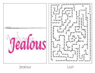
Emotion Words
.jpg)
The way that a line is drawn effects the mood of the design. For this project we needed to take four words and convey the emotion of the word through imagery. A line drawn with jagged edges conveys a sense of anger because people associate sharp points with anger. The font and line of design determines the mood because the emotions we feel can be expressed in many ways. For example the lines in lost form a maze with several beginning and endings. When one is in a maze they are lost and therefore the word lost making a maze adds to the confusion and feeling. A fancy font such as the one used for vain conveys a more sophisticated and higher class feeling than the font used in the background of jealous. This knowledge can be used for future designs such as the quote design because you can get a message across visually with image and not only words. When words are paired with imagery the convey their meaning more strongly. Often we don't take into consideration the connotation of each word we encounter but when the emotion of that word is visually displayed we are forced to accept its true meaning.
Friday, October 1, 2010
FRESH Logo
For Electronic Design class our class assignment was to design a logo for a company which encompassed the companies message while utilizing negative space. The company which I chose to design a logo for was FRESH. FRESH (Family Related Family Solutions for Humanity) is a new non-profit organization working in Northeastern CT. When designing the logo for FRESH, I chose to focus on symbols of community and family. I felt that the strongest symbol for family was a house. I went through a series of design, some including silhouettes and other based primarily on text manipulation. I made this design my own by picking a topic which was personally significant to me. I also used a combination of symbolism and design to create my design. Each design was focused primarily on space and shape. In most of my logos the design was encompassed in an enclosed shape. The shape its self served as the primary message for the logo. Space also was important in my designs in choosing how far apart letters should be and how large the lettering should be compared to the more geometrical shapes. The principle of design which I focused on most was unity. I tried to match crisp, bold lettering with sharp edged shapes, and create more organic lettering for less bold designs.
SR Logo
For the first half of the logo project we had to come up with a logo for ourselves. For three of my designs I focused on my initials (S.R.) and for the fourth design I included all four letters of my first name. The design which I feel describes me best is the second design in the top right corner. This design has a more organic feel and focuses on the peace symbol.
alltelleringet
 |
| Photo Credit |
Subscribe to:
Posts (Atom)
.jpg)
.jpg)

.jpg)